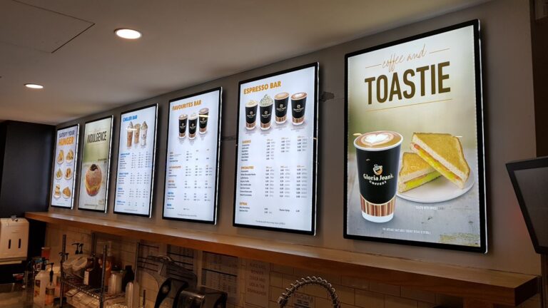
If you’re designing your menu board, you’ve got hundreds, if not thousands of options. All of these choices, big and small, affect your coffee shop’s overall vibe, but some decisions may ruin the guest experience for your customers with visual impairments.
Coffee shops should comply with the Accessibility Act and address the needs of all customers and employees. Menu boards in coffee shops should make it as easy as possible for those with difficulty seeing to be able to read the menu.
For those with a visual impairment, larger and clearly written print or the use of pictures could be an effective option. Furthermore, training your baristas to assist by reading the menu, displaying sizes, and describing the items and costs when requested is another strategy to consider.
Tips to Improve Your Coffee Shop Menu for Customers with Visual Impairments
Use Large Text
You should make your menu board large enough so people who have trouble seeing the text can still read it. However, you shouldn’t use too large a font, since you won’t be able to fit all of your drink options on the page. You also don’t want your menu to “scream” at your customers with too large of letters that could make them feel uncomfortable.
Use a Simple Font
Make sure your font isn’t too fancy or embellished. Use fonts that people are familiar with, such as Baskerville, Arial, Helvetica, Proxima Nova, Open Sans, etc.
Use Contrasting Colours
The colour palette you choose for your coffee shop menu board should match your style, branding, and concept while matching each other without being too loud. For example, you can use a colour scheme generator to create a colour palette that matches your coffee shop concept. Just make sure it’s contrasting enough to be seen from far away.
Use Pictures
In case you want to liven your menu up, you might want to add a picture or two if it matches your menu board and coffee shop’s overall style. Images of food look more enticing on backlit menu boards. Colour plays a crucial role in food photography. Do you think you would be drawn to food pictured in black and white? How about when the colours are fading? Probably not.
A backlit menu display, on the other hand, gives the food great power with bright, crystal-clear images. Anyone could be compelled to stare at it and be tempted to purchase the food pictured in delectable hues.
Break Up the Text
Use several menu boards or break one into logical segments: hot drinks, cold drinks, specials, other drinks, and additions. This will make it easier for customers to make a decision.
Keep It Bright
Your menu board should be bright enough so it’s easy to see and read. If you decide on a darker style or your coffee shop lacks natural light, use a separate light source that might illuminate your menu board or a menu board that lights up inside. A great way to achieve this is by using a static backlit display.
Have a Backup Menu
If your visually impaired customer is still unable to make out your signage or is completely blind, don’t give up! To still delight your visually imparied customers, having a physical version of the menu they can hold and read close-up or is imprinted with braille will make the experience even more welcoming and accommodating to their needs.
Conclusion
Help your customers see better by trying out static backlit LED displays for your coffee shop! Contact VitrineMedia in New Zealand to get started with one of our many retail sign solutions.


